Why customers abandon their cart in your online store (and how to avoid it)
Discover the real reasons behind cart abandonment in ecommerce and learn technical and UX strategies to transform clicks into real customers.
You have invested budget in advertising, optimized your social networks and managed to get users to your online store. They browse your products, add items to cart, go to the checkout page and… they disappear.
If this scenario sounds familiar to you, you’re not alone. For B2B business owners and retailers alike, shopping cart abandonment is one of the biggest pain points in eCommerce.
According to industry studies, the average cart abandonment rate in ecommerce is around a staggering 70%. This means that out of every 10 customers who are ready to buy, 7 leave without leaving a cent.
The good news is that most of these abandonments are preventable. It’s not that your product is bad or too expensive; In the vast majority of cases, the problem lies in the digital experience you are offering.
Below, we break down the real culprits behind this capital flight and how modern technology can fix them.
1. The silent killer of sales: A slow website
We live in the era of immediacy. When a corporate client or end consumer decides to make a purchase, their patience is minimal. If your store takes more than 3 seconds to load, you are automatically losing more than half of your potential buyers.
Poor web architecture, heavy unoptimized images, or overloaded code make the user’s browser have to work too hard. In technical terms, this translates into poor performance on the frontend (the visual part of your website) and slow response times on the backend (the server).
The solution: You need a store built with modern technologies that prioritize performance (such as lazy loading of images or static site generation). A fast website not only improves the user experience, but is essential for SEO, allowing you to rank better on Google and reduce your customer acquisition costs.

2. Lack of transparency and “Surprise Costs”
Nothing ruins a buyer’s confidence faster than reaching the final checkout screen and discovering that the total is significantly higher due to hidden taxes, handling fees, or unexpected shipping costs.
This is a classic User Experience (UX) Design problem. If the user feels that they are being deceived or that vital information is being hidden from them, their instinctive reaction will be to close the tab.
The solution: Implement dynamic shipping calculators on the product page itself or in the first step of the cart. Visual and financial honesty from the first click generates invaluable trust and prevents negative impact at the crucial moment of checkout.
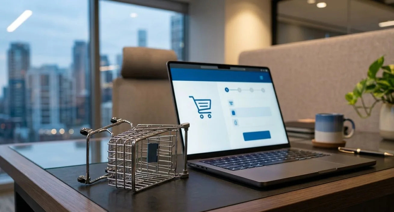
3. A friction-filled checkout process
Do you force your users to create an account before they can purchase? If so, you’re building a brick wall in front of your cash register. Forcing registration is one of the main causes of frustration and abandonment.
Furthermore, an endless payment form, where the customer has to enter redundant data or navigate through three different screens, saps purchase motivation. In the B2B environment, where buyers are often short on time, an inefficient process is unacceptable.
Strategies for a frictionless Checkout:
- Enable “Guest Checkout”: Allows the user to pay only with their email and shipping information. You can offer to create an account after the sale is secured.
- Address autocomplete: Integrate APIs that automatically suggest and complete the customer’s postal address based on their zip code, saving you valuable seconds.
- Multiple payment options: From corporate credit cards to digital wallets (Apple Pay, Google Pay). The fewer barriers there are between intent and transaction, the better.

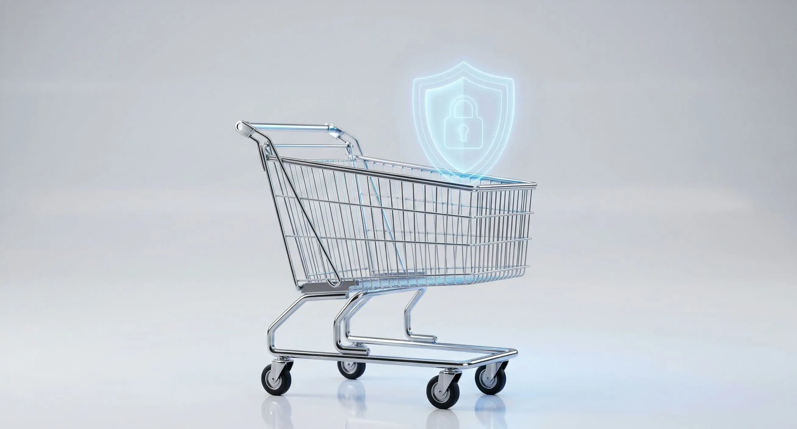
4. Design that does not inspire security
In the digital world, your website is the showcase and the seller at the same time. If the payment page appears outdated, has broken links, or lacks security indicators (such as SSL lock or payment guarantee seals), the customer will feel a real risk when entering their credit card details.
18% of shoppers abandon cart simply because they “didn’t trust the site with their credit card information.”
The solution: The visual design must convey authority and corporate neatness. A clean, modern and structured design, supported by a robust technological infrastructure, subliminally communicates that your company is serious, stable and secure.